How artists today use hue, saturation, and contrast not just to please the eye — but to move the mind.
Color is never innocent. Long before a viewer reads a title card, identifies a form, or decodes a composition, color has already done its work — stirring something primal, directing attention, shaping mood. In contemporary art, this psychological force has become both a medium and a message. Artists across disciplines are deploying color with increasing intentionality, drawing on psychology, neuroscience, and cultural theory to create works that speak directly to the nervous system.
To understand why color carries such weight, it helps to start with the body. Human color perception is processed in the visual cortex but immediately relayed to the limbic system — the brain’s emotional center. This neurological shortcut means color registers as feeling before it registers as information. Red quickens the pulse; blue slows it. This is not metaphor. Studies in environmental psychology confirm that room color can measurably affect heart rate, appetite, and even pain tolerance. Contemporary artists are acutely aware of these biological baselines — and they work with them, against them, and around them.
-
Warm colors and the theater of urgency
In contemporary painting, the warm end of the spectrum — reds, oranges, and deep yellows — has taken on a charged political and emotional vocabulary. Artists like Kara Walker and Kehinde Wiley have used saturated reds and golds to invoke both grandeur and violence, beauty and menace simultaneously. The warmth invites; the intensity unsettles. This doubling — seduction and discomfort living in the same hue — is one of the most sophisticated moves available to a contemporary colorist.
Orange in particular has undergone a radical revaluation. Once considered garish or commercial, it now appears in the work of artists from Marlene Dumas to Rashid Johnson as a color of raw honesty — neither the passion of red nor the safety of yellow, but something exposed and unresolved. Its psychological associations with warmth and social energy make it ideal for works concerned with community, trauma, and visibility.
Color is not an addition to the work — it is the argument the work is making before language arrives.
-
Cool palettes and the architecture of grief
The cool spectrum — blues, grays, muted teals — has long been associated with introspection and melancholy, but contemporary artists have complicated this reading substantially. Wolfgang Tillmans’ photographic work uses desaturated blues and greens not to signal sadness but to create an atmosphere of suspended time — color as a way of holding the viewer inside a moment that feels both intimate and enormous. The psychological effect is not depression but a kind of open attention.
Meanwhile, artists working in the traditions of arte povera and conceptual minimalism have weaponized gray’s neutrality. Gray refuses emotional instruction. It offers no comfort, no alarm. In works by Gerhard Richter or Luc Tuymans, gray becomes a color of moral ambiguity — a visual correlate for the unspeakable, for history that cannot be cleanly rendered. Psychologically, it creates a productive disorientation, removing the viewer’s usual emotional handholds.
-
Saturation as emotional volume
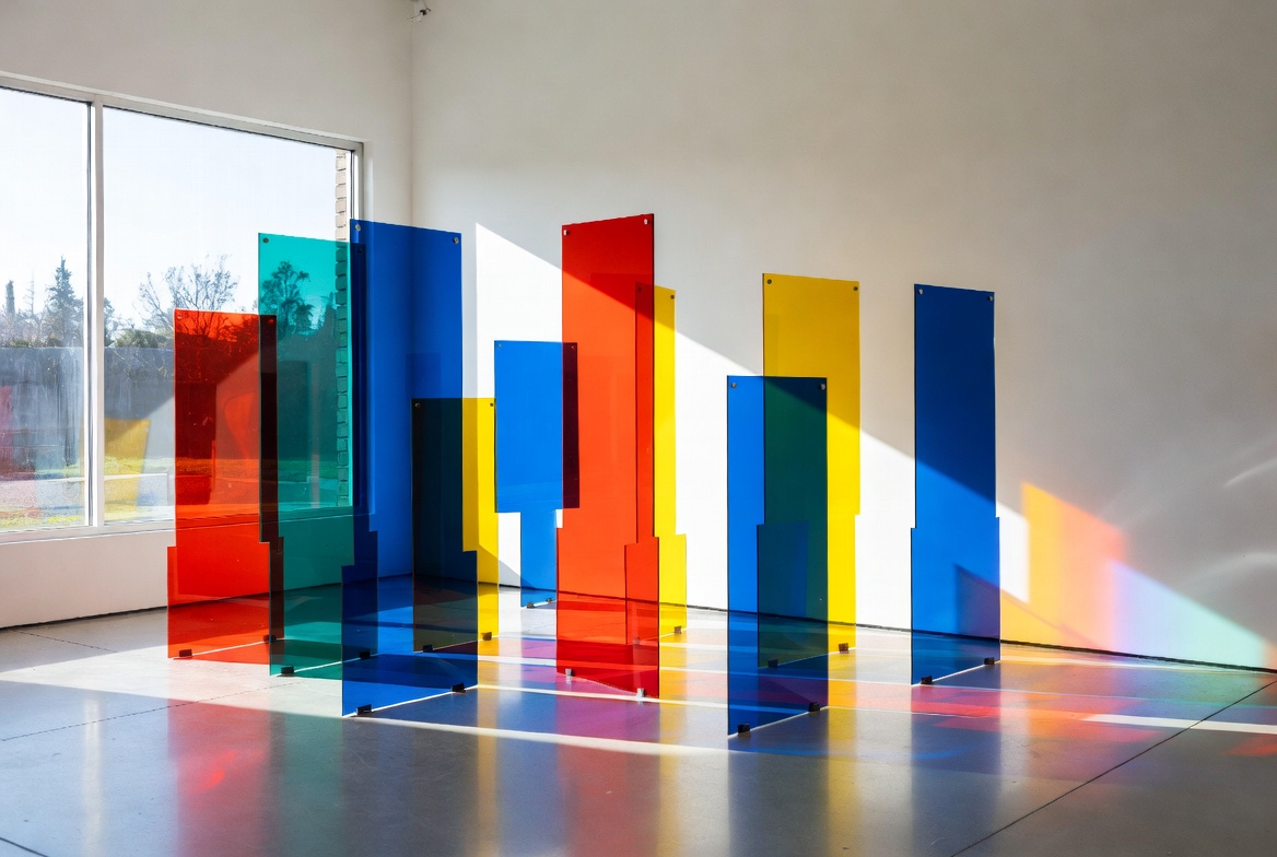
If hue is the note, saturation is the volume. Highly saturated color demands attention; it presses against the retina and refuses to be ignored. Contemporary artists working in digital media and large-scale installation — from James Turrell’s immersive light environments to Yayoi Kusama’s Infinity Rooms — use extreme saturation to produce psychological states that border on the physical. Visitors frequently report disorientation, euphoria, or vertigo. The color isn’t representing an emotion; it is producing one.
Desaturation, by contrast, creates psychological distance. A muted palette signals restraint, history, memory, damage. Many contemporary photographers working with archival or documentary material desaturate their images deliberately, using color as a temporal marker — signaling to the viewer that what they are seeing is already receding, already becoming the past. The psychology of faded color is the psychology of loss.
-
Cultural color and the problem of universalism
Any serious discussion of color psychology in contemporary art must reckon with the limits of universalism. White carries associations of purity in Western traditions and mourning in parts of East Asia. The psychological responses to green vary dramatically between cultures embedded in lush natural environments and those where green signals sickness or envy. Contemporary artists are keenly aware that color does not mean the same thing everywhere — and that assuming it does is itself a form of cultural imperialism.
Artists like Theaster Gates, Sonia Boyce, and El Anatsui embed culturally specific color vocabularies in their work, trusting that viewers from within those traditions will experience layered meaning while others encounter something more open. This is not a failure of communication — it is an invitation to recognize the limits of one’s own color education. The psychological experience of a color is partly hardwired and partly learned, and contemporary art at its best makes both of those facts visible at once.
-
Black, white, and the politics of absence
Black and white occupy a special place in the contemporary color conversation — partly because they challenge the definition of color itself, and partly because both carry enormous cultural freight. Black in contemporary art is rarely simply the absence of light. In the paintings of Mark Bradford or the sculptures of Simone Leigh, it functions as density, as history, as gravity. White, meanwhile, has been interrogated by artists from Robert Ryman to Adrian Piper as a color that presents itself as neutral while encoding enormous assumptions about who and what occupies the center.
The psychological effect of these non-colors is to slow the viewer down — to make them aware that they are interpreting, not simply seeing. That reflexive awareness is one of contemporary art’s most important gifts. When color stops being decoration and starts being argument, the viewer becomes a participant in meaning rather than a passive recipient of it.
-
Looking forward: color in the digital age
The emergence of digital and generative art has introduced a new chapter in the psychology of color. Screens emit light rather than reflecting it, producing colors of impossible saturation unavailable to traditional painters. Artists working in new media now have access to the full range of human color perception — and beyond, since digital environments can simulate colors that push against the edges of what the eye can distinguish.
This expands the psychological toolkit considerably. Color in a Refik Anadol data sculpture or a Casey Reas generative print is not simply chosen but computed — emerging from algorithms that respond to data, time, or viewer presence. The psychological experience becomes dynamic, collaborative, and unpredictable. Color stops being a decision made once and becomes something that happens between the artwork and the person standing before it.
In this sense, contemporary art’s engagement with color is ultimately a conversation about consciousness itself — about how we make meaning from sensation, how culture shapes perception, and how artists can use the most immediate and primal of visual elements to say things that resist being said in any other way. The psychological power of color is not a trick or a technique. It is the evidence that art works at the level where thinking and feeling have not yet been separated.